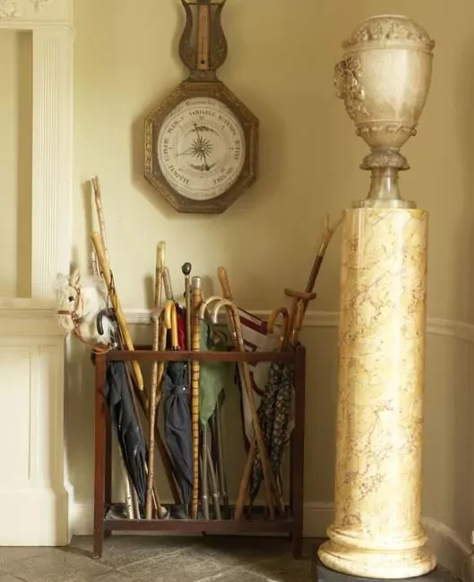
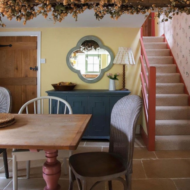
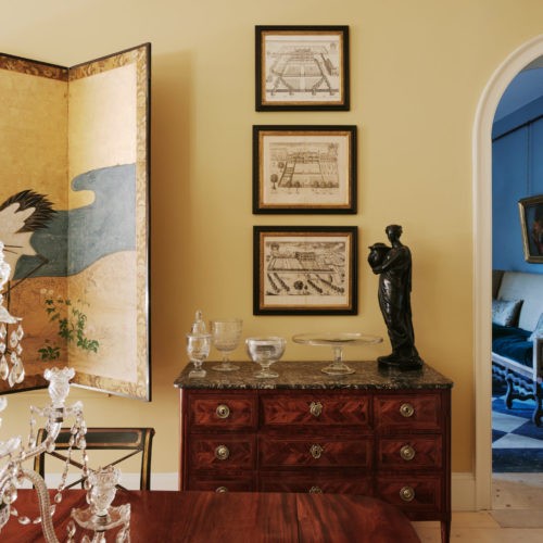
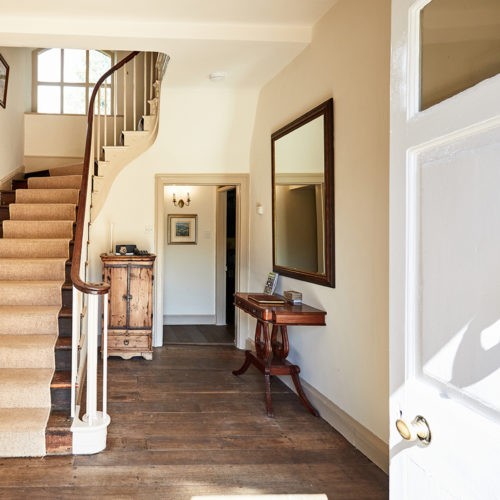
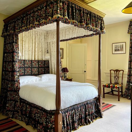
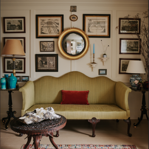
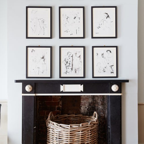
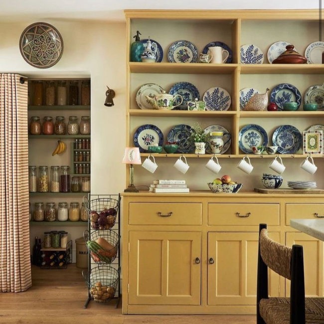
Our yellows really do bring the sunshine in and whether you prefer mellow to bold we will have the perfect colour for you. Positive Paints only! Embracing colour and choosing the right shade and tone for your room, whether it is facing North, South, East or West, can revive your home and help you breathe new life into your interiors.
Edward has explained the use of yellow and why a lot of us resonate with it being a ‘happy’ colour, ‘one of the most iconic yellow rooms was the one decorated by tastemaker Nancy Lancaster at 39 Brook Street in the 1950s, its success was in the way the colour was applied, being built up in glaze over a white ground colour. Its still inspiring to this day.’
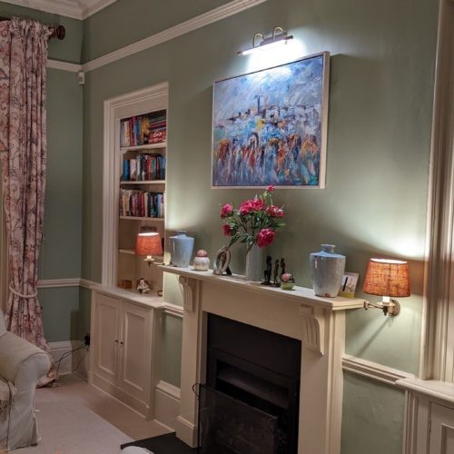
'Lute'
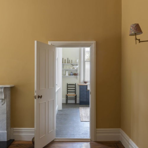
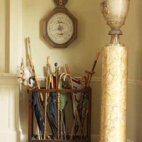
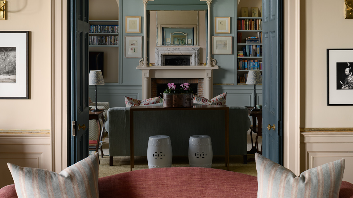
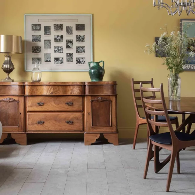
The designer’s go-to warm neutral, Lute, which is neither yellow nor brown, more of a timeless warm and uplifting neutral, made using red and yellow pigment. The pigmentation of this colour is from where it gets its name (before the Civil War apparently) as it comes from the Latin adjective luteus. I love its robust character, it will instantly proclaim a Georgian residence of the middling sort and it is a real friend to an interior with good architectural bones.
We offer Lute in three lighter shades. 60%, 40% and 20% lighter shades, we make historical paints for period properties so the walls can maintain their breathability for the next 200 years.
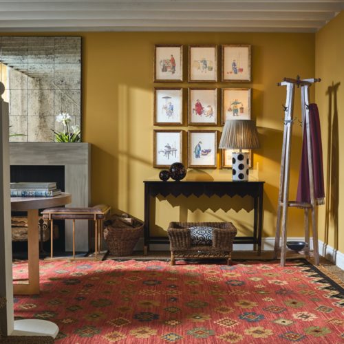
'Persian'
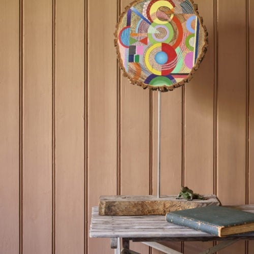
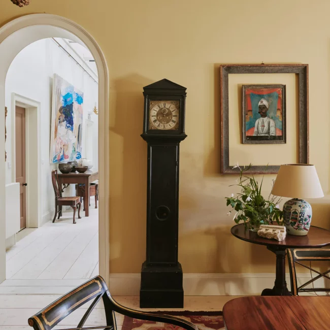
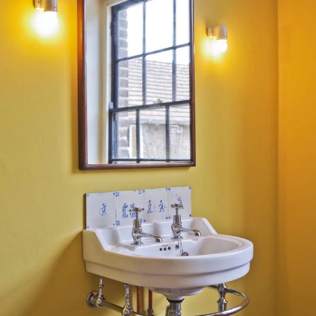
This is a strong brown yellow that will work well with polished timbers and high contrast trim colours/whites. It is warm but bold and will stand up to eye-catching furnishings. The name comes from the use of Persian buckthorn to create strong yellow dyes many centuries ago, although often it was superseded by other names when processed into pigments – even Dutch Pink! Like our Persian, all our natural paints are so much more than beautiful colour, they are created to avoid the harmful impact on our health.
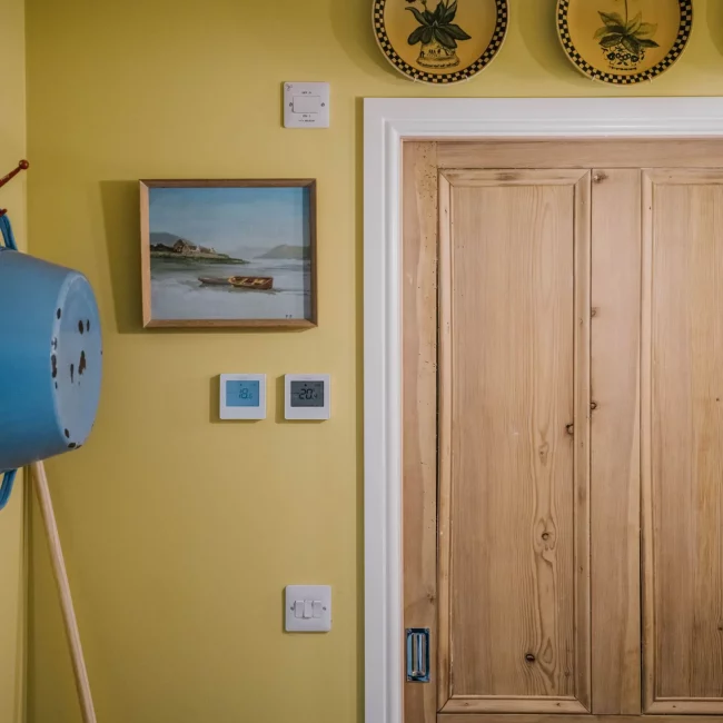
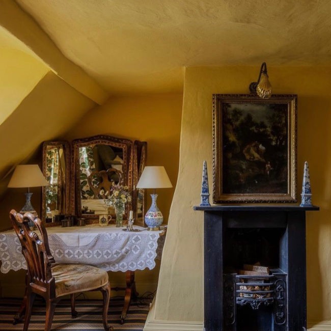
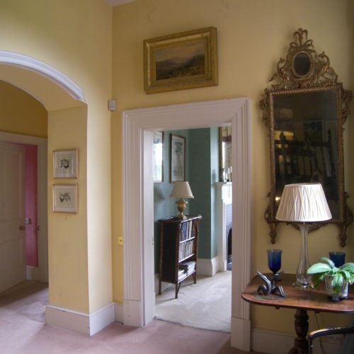
'Quaker'
“Earth pigments mixed with white were used to make Quaker tints in the early 19th century. Basically they were coloured off-whites. I have made 50/50 raw umber and yellow ochre shade with a hint of chrome yellow to give it a sunny disposition. A great hall colour and can be used on woodwork to compliment strong colours. Equally at home on wood or plaster. With all our finishes, we are leading the way in producing a truly earth-friendly paint range and supplying an honest declaration of our ingredients.” Edward Bulmer
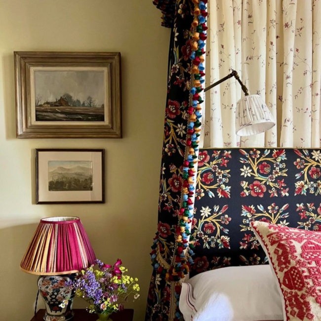

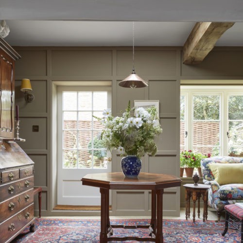
'Trumpington'
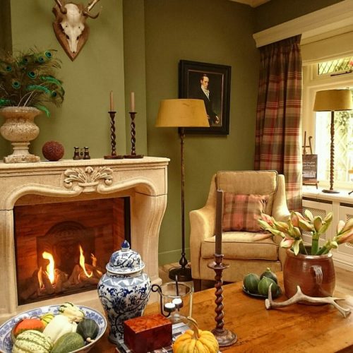
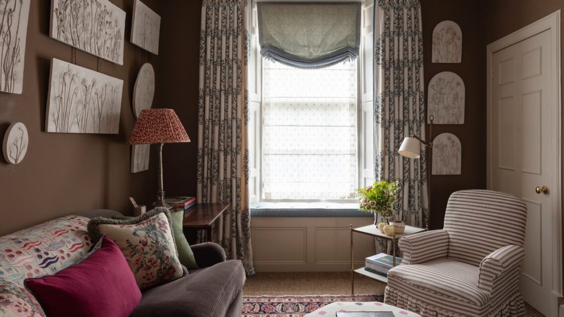
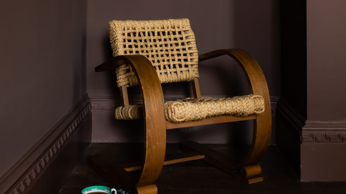
“An earthy tobacco shade can work really well in rooms you want to feel warm, rich and intriguing. It is a fabulous backdrop and can be used in a great variety of rooms. As with all our tones it is based on earth pigments and iron oxides. Funny that such a life-giving tone should usually be named after the killer weed; but we have put tried to put a positive spin on it by naming it after the late Baroness Trumpington who claimed to be partial to a cigar after making love!” Edward Bulmer
Trumpington has such unrivalled depth which can only be created with earth and mineral pigments, kind to nature and kind to period properties, our natural paints do not cost the earth and they allow the walls to breathe.
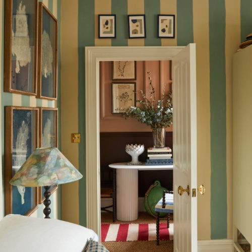
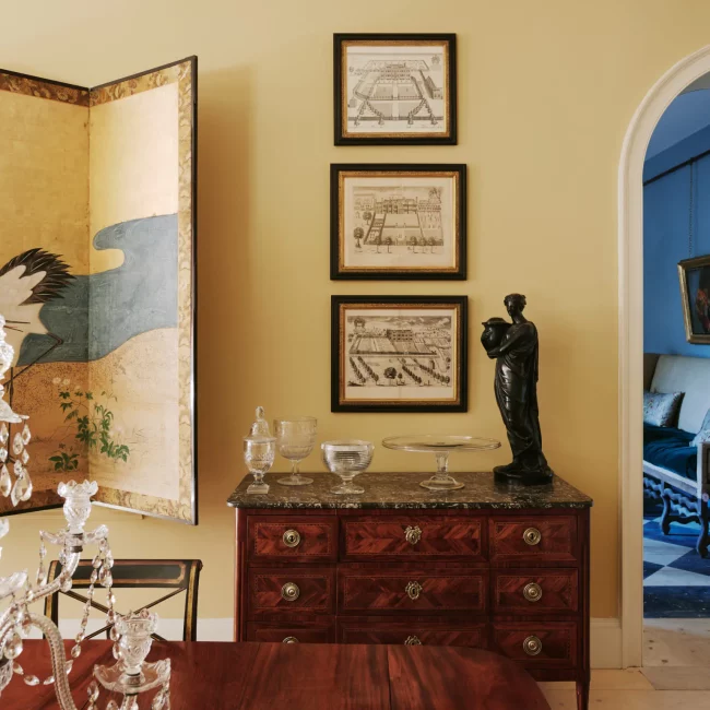
Thinking of going yellow but. not sure whether to brave it? Trumpington is a perfect way of adding colour if you do not want to do a complete yellow interior takeover.
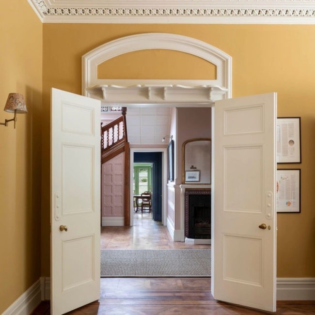
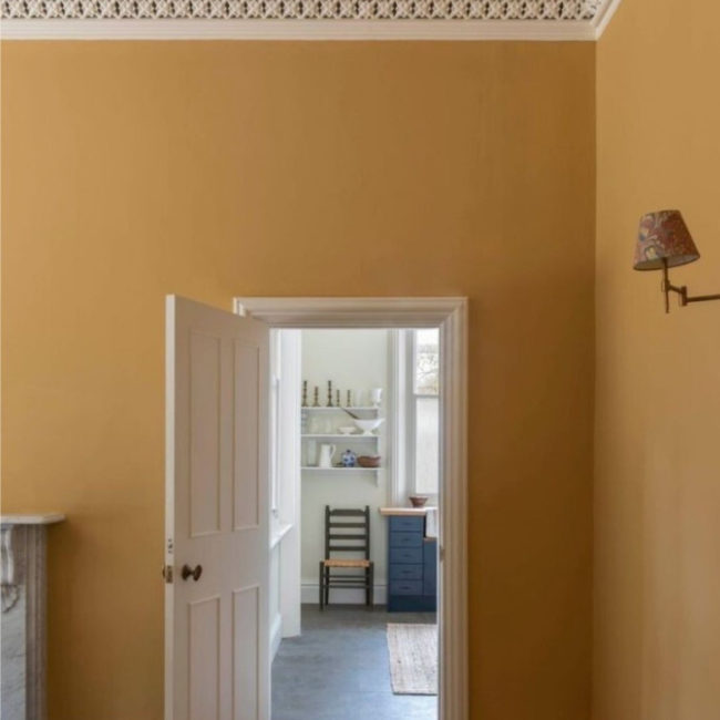
We knew that part of the Forge would be painted in a yellow but all the samples that we tried were disappointing: too grey, too flat, too insipid, too primary. The bones of the Forge are C12th so we needed a colour that felt 'old' and serious whilst still being unusual and warm. Trumpington is the colour that everyone comments on; it is sophisticated and enveloping yet also exciting - I have never seen a colour like it and I couldn't be happier.
'Naples Yellow'
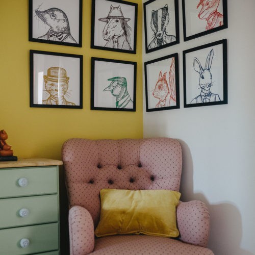
An eruption of colour – Naples Yellow literally as this name came about through a belief that it originated in the volcanic area around Naples! It is a strong colour for those brave enough to couple it with other gutsy colour tones and individually designed pieces. It will wake up the senses and lift the spirits, appealing to the architect designer as well as the confident home owner.
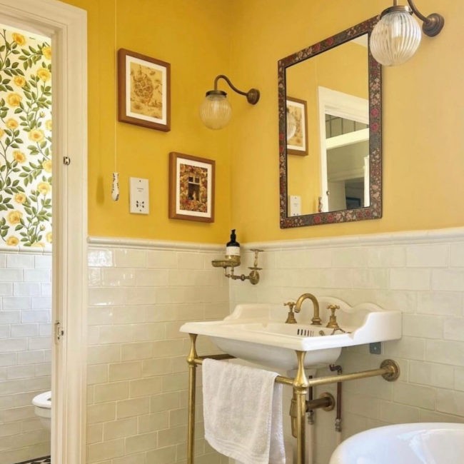
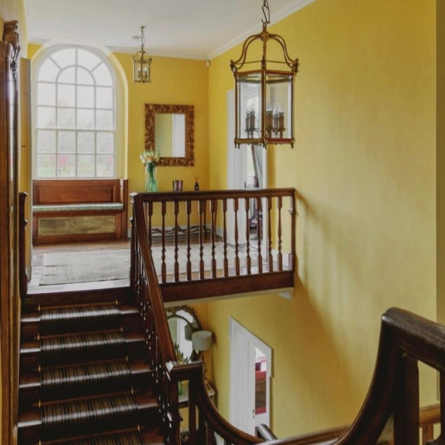
I knew I wanted to paint the ceiling yellow the minute I saw this room, and specifically this colour, Naples Yellow. it is the most hopeful and happiest colour, and makes me think of Positano beach umbrellas - particularly as I can see the sea from the window. It’s my bedroom ceiling, so it's a very uplifting start to the day. I often write lying in bed, so this room really needed to be somewhere I was going to enjoy spending a lot of time, and I do - and a lot of that is due the ceiling (and the matching curtains!)
'Warm Stone'
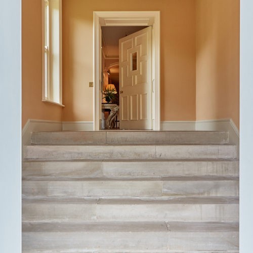
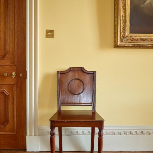
“Another Carlton House colour, where it was used as a ceiling colour but I tend to use it on walls where a yellowy hue is desirable but you don’t want to use a full yellow tone. It has a simple pigment mix to give a colour that sometimes looks yellow, sometimes white and sometimes stone – a versatile mainstay in my decorating repertoire. Warm Stone is created in a carbon neutral environment with no toxic waste produced.”
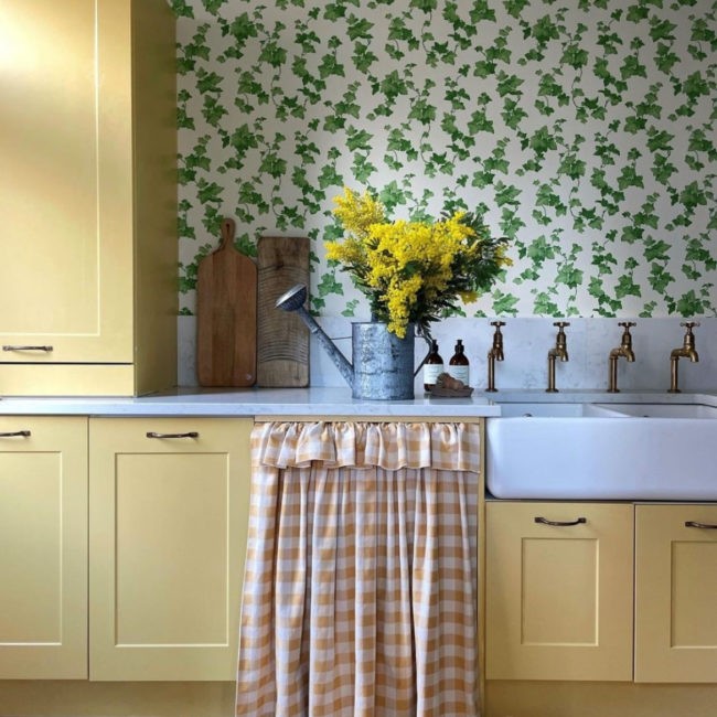
This soft buttery yellow goes with everything and makes a charming cottage wall colour, as seen below at the home of colour consultant, Emma Diaz. it is equally at home in a hallway of larger architectural proportions and can help tonal flow throughout a house when using bolder choices in other rooms.
