Words by our colour consultant Fiona de Lys
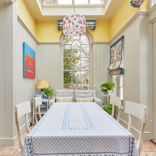
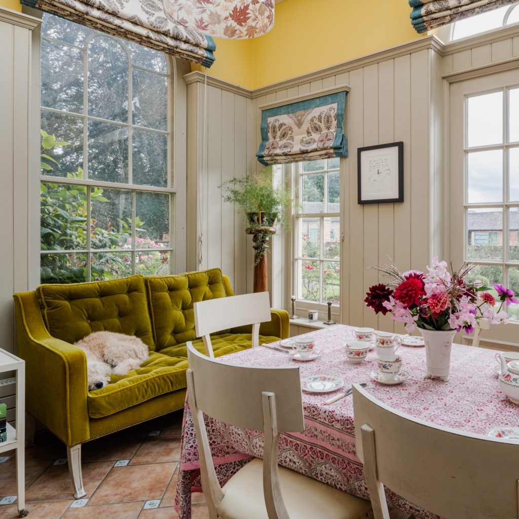
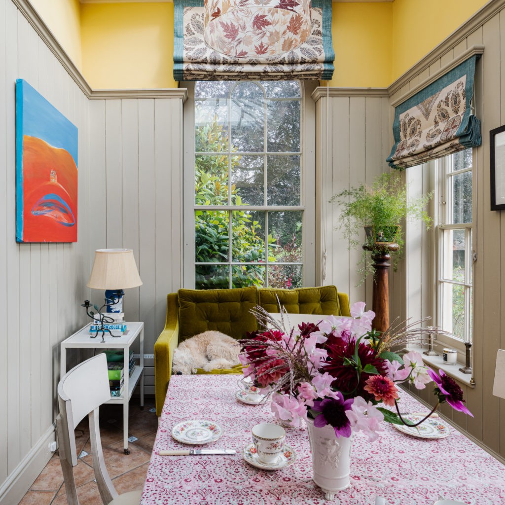
Bright conservatories with skylights can be awkward spaces to paint in colour. The trick is to find a way to absorb the light without dulling it down or overpowering it with a vivid colour or even illuminating it with something too white. Here the light falls into this South facing room, which also receives cooler morning light and so two colours have been cleverly used to capture the warmth from above and then tone it down at eye level where it reads onto the cooler East side of the room.
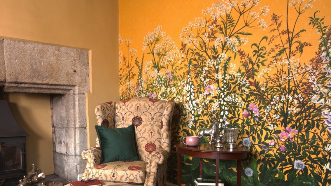
‘Brimstone‘ above carries a lightened and lively yellow quality to it, and would be rather intense at this lower level, but when paired with ‘Dove‘, the light softens down and the illusion is an almost invisible colour with warmth in mind. It’s tempered down by combining it with ‘Dove‘, which gives it a little bit of neutral depth further down the wall. If you have panelling, you could use it on panelling, maybe on architrave and skirting and window frames particularly.
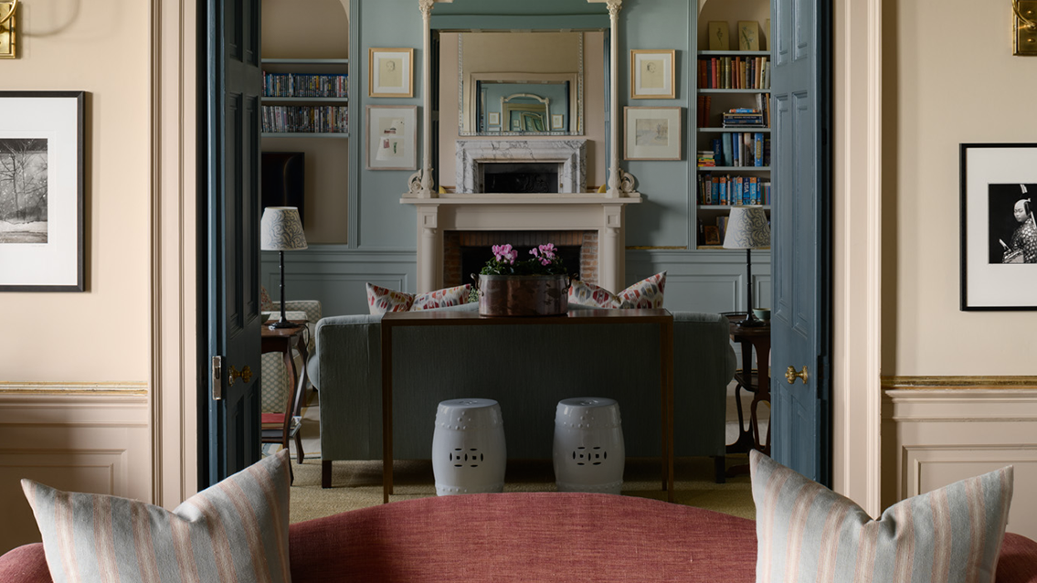
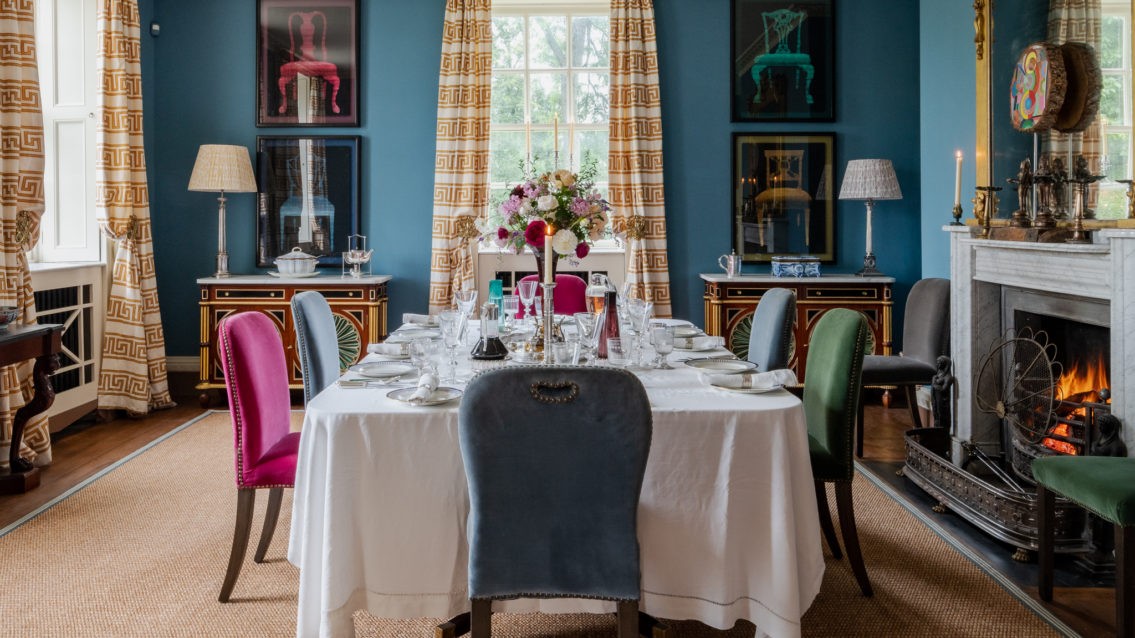
Try a mid deep blue such as ‘Vert de Mer’ as an accent colour for a doorway, or maybe ‘Mummy’ on the skirting and wood trim.


No matter which room, aspect or lighting, these blogs along with the reels over on our Instagram page @edwardbulmerpaint will be your starting point to building an interior scheme with complete colour confidence. If you already have one of our natural paint colours in your interior but are looking for a woodwork or a ceiling colour to pair it with, or perhaps you would like to paint a wall, woodwork colour and cabinetry all different then this is the guide for you. We shall simply help you ‘get the look’ and you can drop all the samples into your basket with just a click.