Halls and Hallways
If you are struggling to find the best colour for your hall or hallway then keep scrolling for all the inspiration you will need! Halls and hallways are often the first spaces you enter into in a home, but they can be neglected or an afterthought. Hall spaces most commonly lead to the main rooms and staircases, so they are a key transitional area in the home, so it is important to create a scheme that helps the flow into the rest of the house. Hallway spaces can be narrow or lacking natural light, so choosing the right colour for this space is important in achieving a balanced and welcoming space.
Go bold, go colourful
If the space is right then go bold with colour!
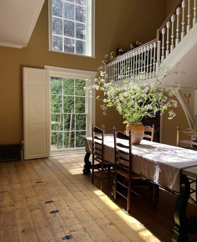
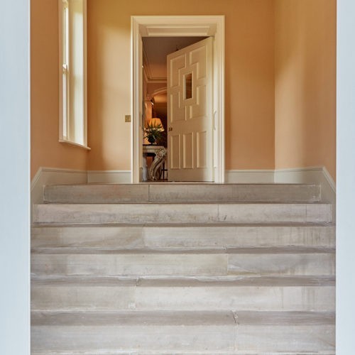
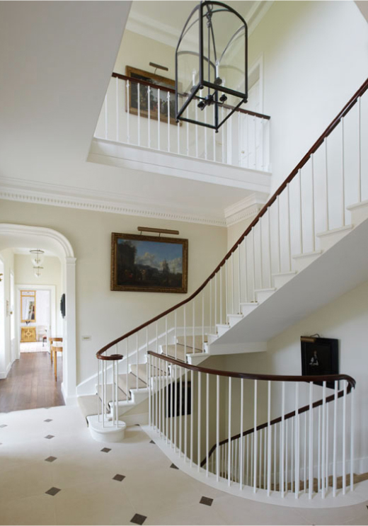
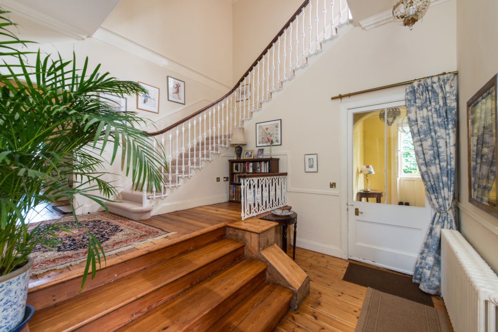
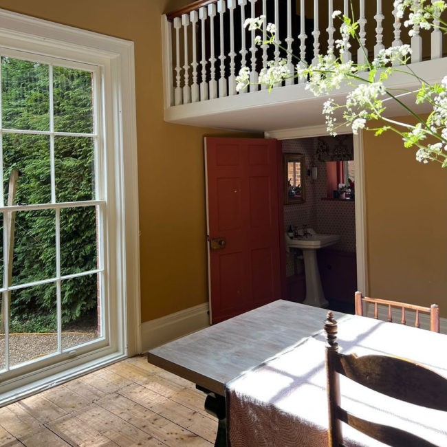
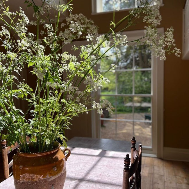
If you have a light, open hall or hallway space then why not add some rich colour which will be bright during the day and warm in the evenings and in lamp light. We love the use of ‘Trumpington’ in the double height hall below, with interior design by Charlotte Crofts. This is a great example of adding a highly pigmented colour such as this deep tobacco tinted yellow to an open space, drawing out all the powerful tones in the light but also created a warm atmosphere when the sun has gone down.
Edward Bulmer also advises how yellows are a great hallway and passage colour for walls but it also depends on what pigment base the yellow is made up of.
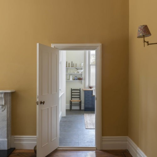
Halls and passages work well with ochre-based tones while a bright mineral yellow can articulate the volume of a living room to great effect. Just bear in mind that starved of light, yellows can seem a bit green to the green. There are, however, ways to make this hue look contemporary: juxtaposed with clear white, it looks fresh and confident. Deep and slightly tobacco-like shades can lend a chic, suede feel to a room, especially if you tie it in with a complementary trim.
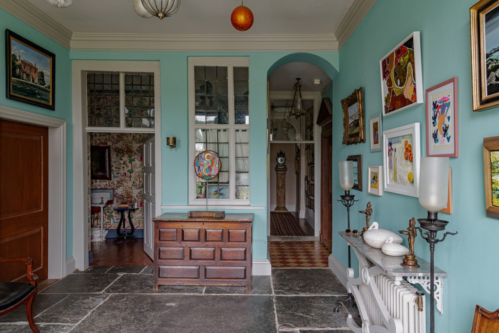
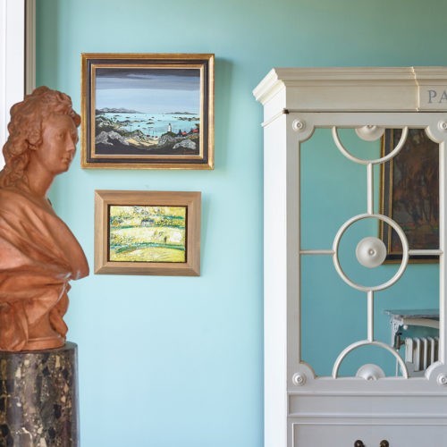
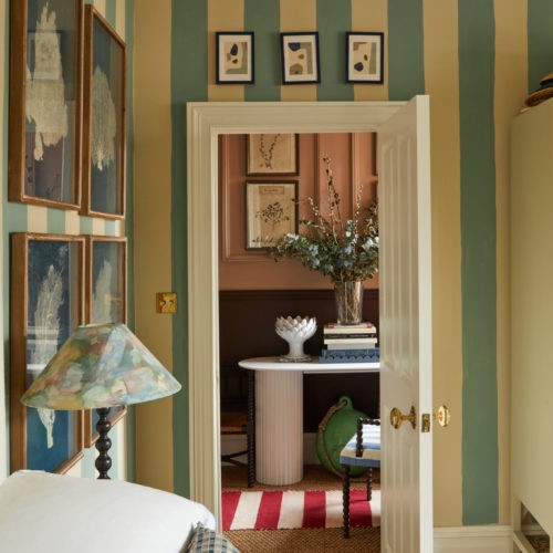
Sometimes people think that a hall space needs to remain neutral so as not to clash with any joining room schemes but as long as you get the tonality right with the rest of your space a hall is definitely somewhere you can add colour rather than just keeping it neutral. This ‘Turquoise’ room is a perfect example of bringing in a brighter, fresher colour into a hall space.
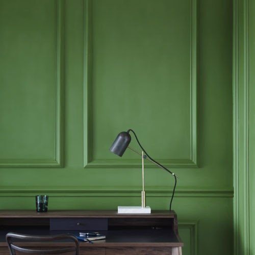
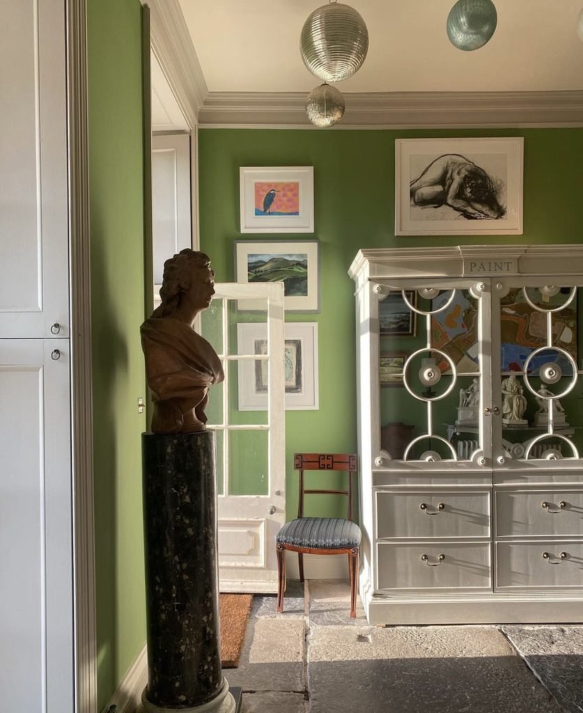
Hallways can be dark and awkward spaces so there can be a fear of embracing colour. Small spaces can carry strong colours too though, so if you are thinking of adding colour, try one of our brighter shades like ‘Invisible Green’ or ‘French Blue’. These will anchor and add a brightness to a space that could otherwise feel lost.
Neutral Pinks
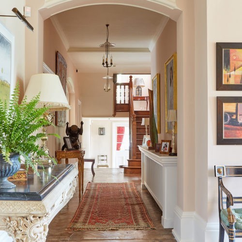
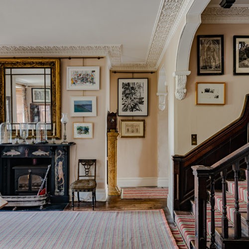
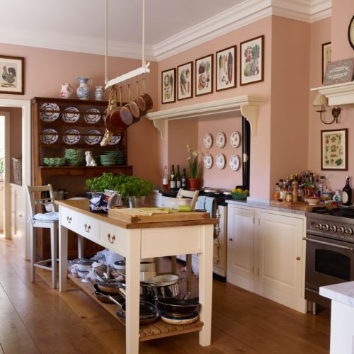
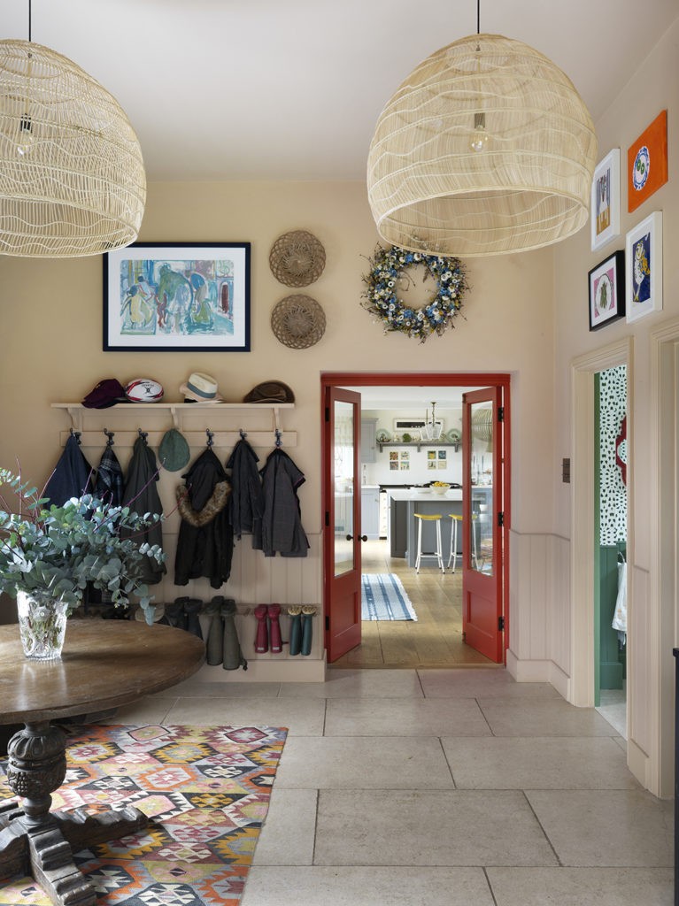
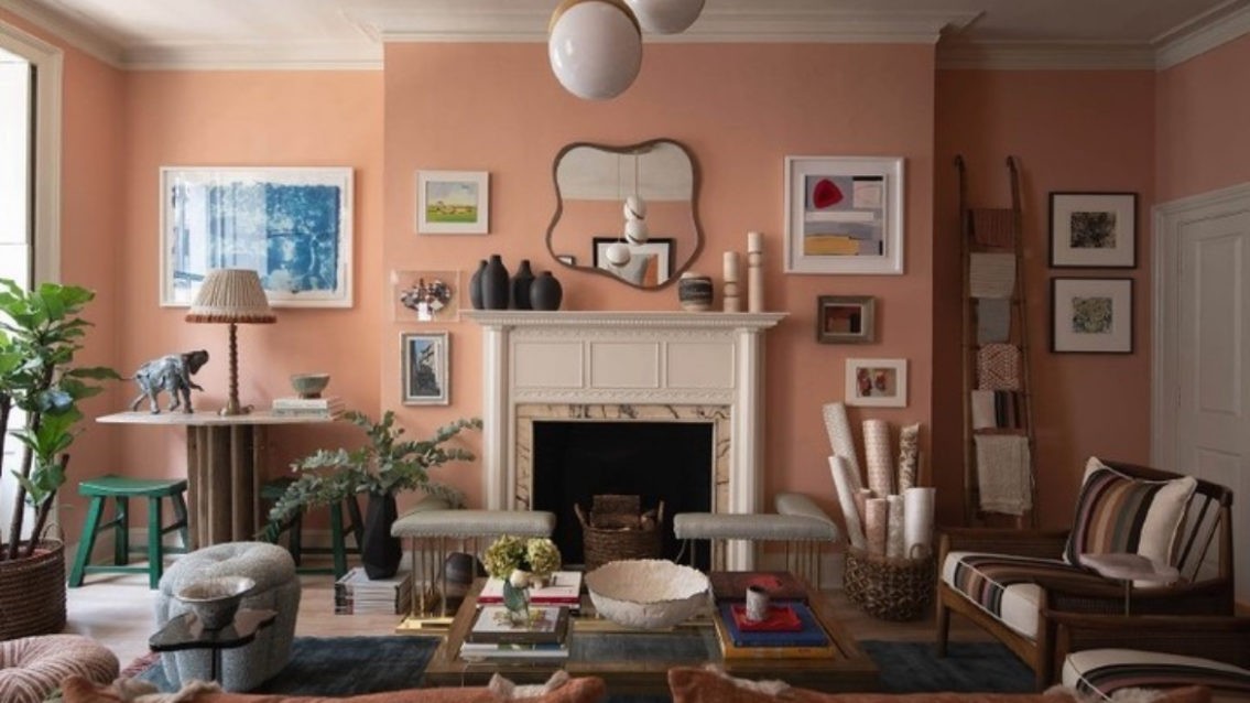
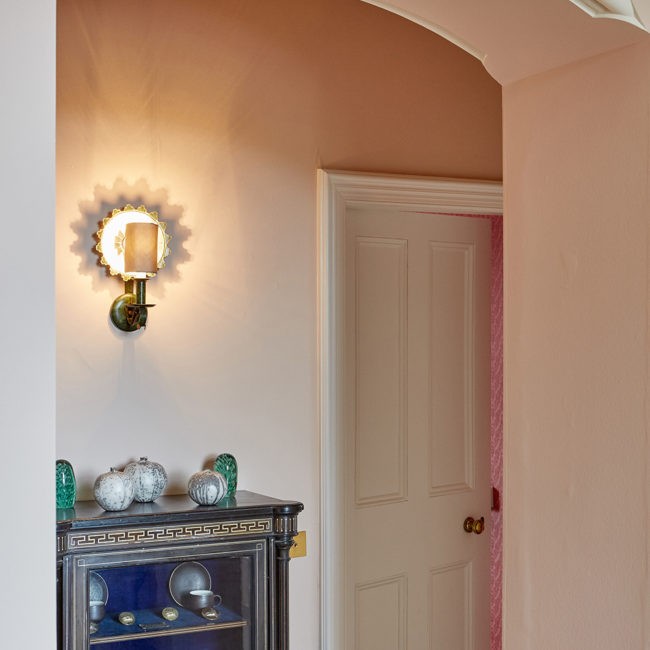
Our range of soft neutrals and plaster pinks are consistently some of our top selling colours. They work especially well when it comes to creating a light, neutral space but not wanting to use an off-white or grey. These colours are perfect for a hallway or landing space, as they add warmth and react well with all lights, but are not too over-powering a shade to dominate a space.
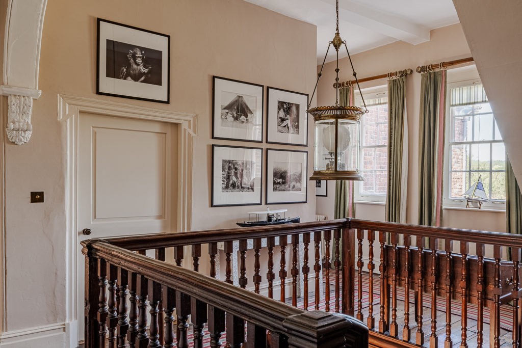
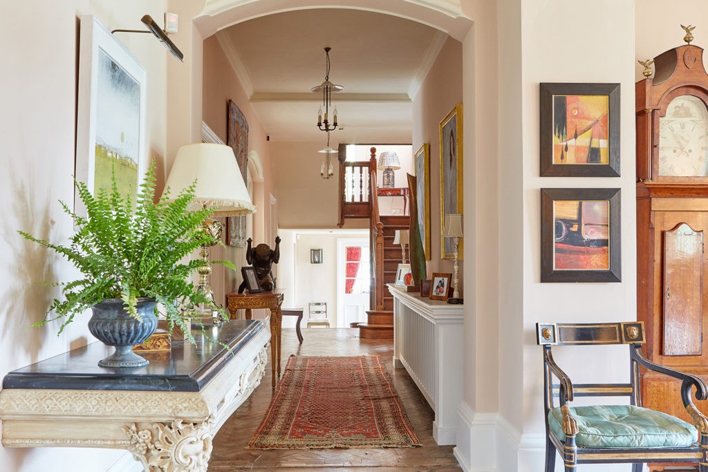
Here is a great example of our ‘Lilac Pink’ in use at Edward’s own home, painted in the hall and continuing up the stairs and on the landing.
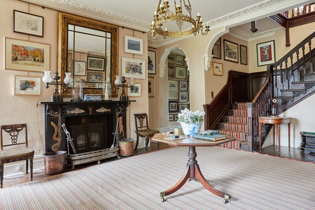
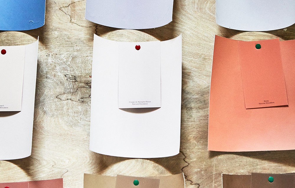
‘Jonquil’ is a popular plaster pink colour which we also offer in shades or 20%, 40% and 60% of the full colour for those who love ‘Jonquil’ but want something slightly lighter. ‘Jonquil’ works well in this hallway space as the colour reacts brilliantly with the natural curves and shapes of the interior and also with the different lights as you travel through the hallway.
Brown C'est Chic
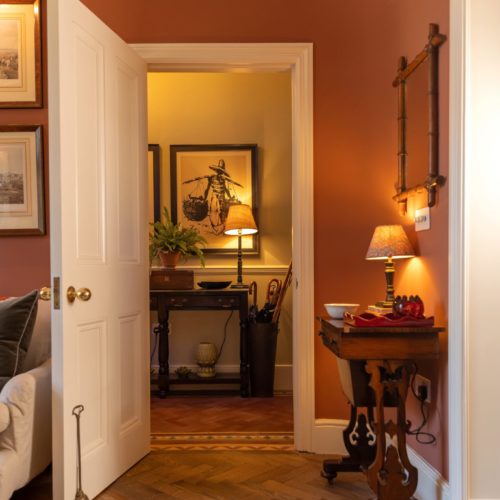
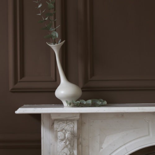
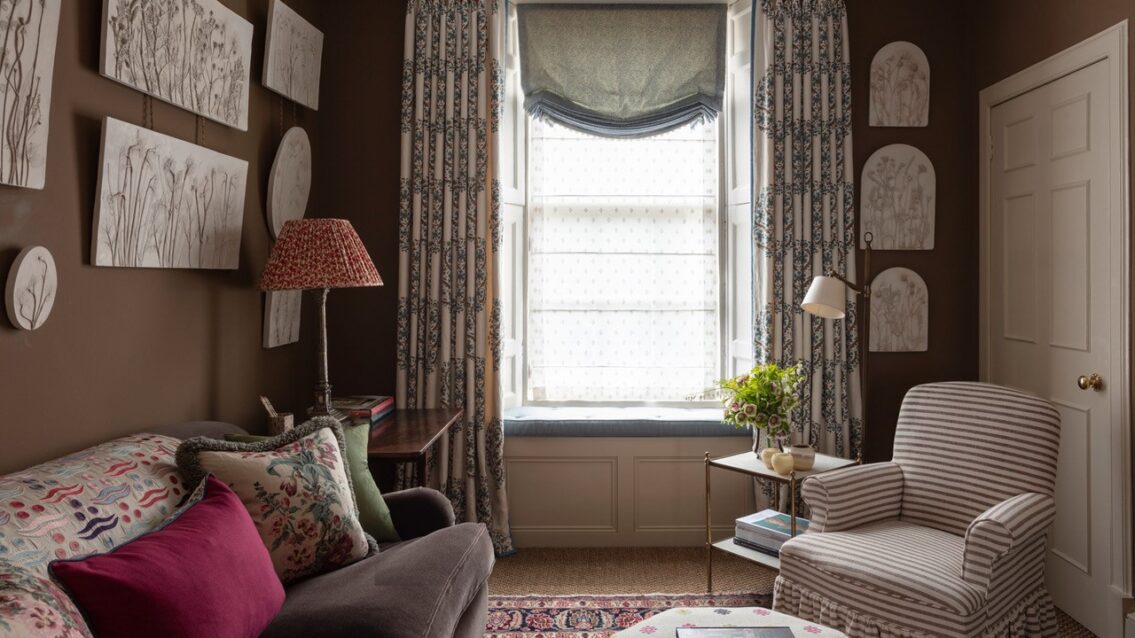
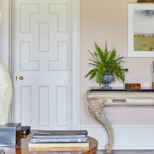
Brown is usually considered a dark colour, especially for interior spaces, however we have seen a rise in chic browns creating the most elegant spaces. Below is a great example of using brown in a hallway space in the home of James Mackie. He has used our ‘Mummy’ which has interesting green undertones.
Warm Greys
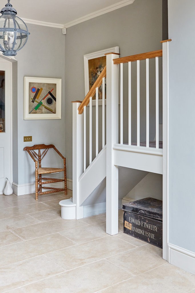
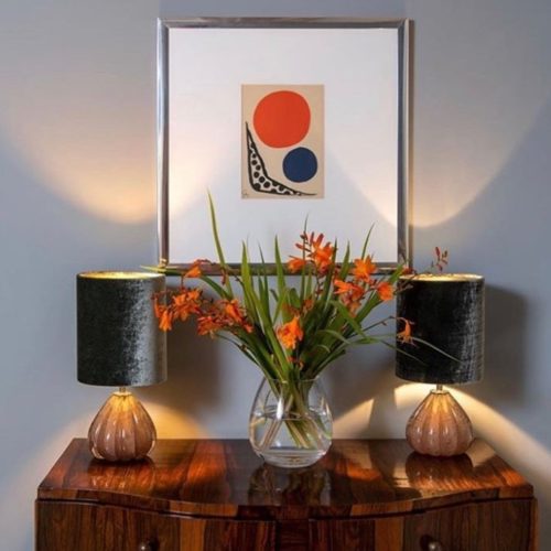
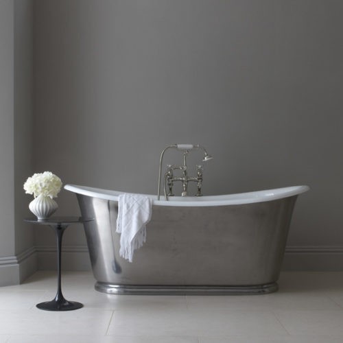
We know that greys will never fall out of fashion – they are far too useful. If you avoid them being over blue or over black they will always accommodate your other colours and furnishings. Edward’s greys are packed full of pigment which prevents them from being flat or cold and you will find an unrivalled richness that can be paired with any colour on the chart.
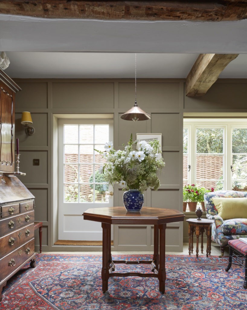
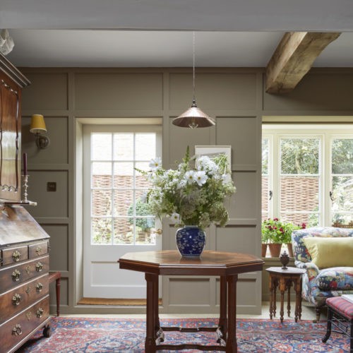
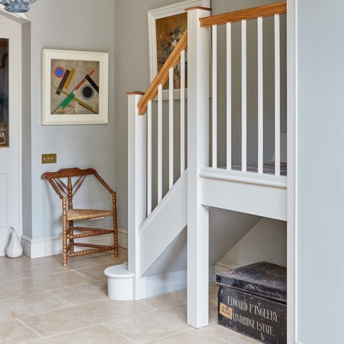
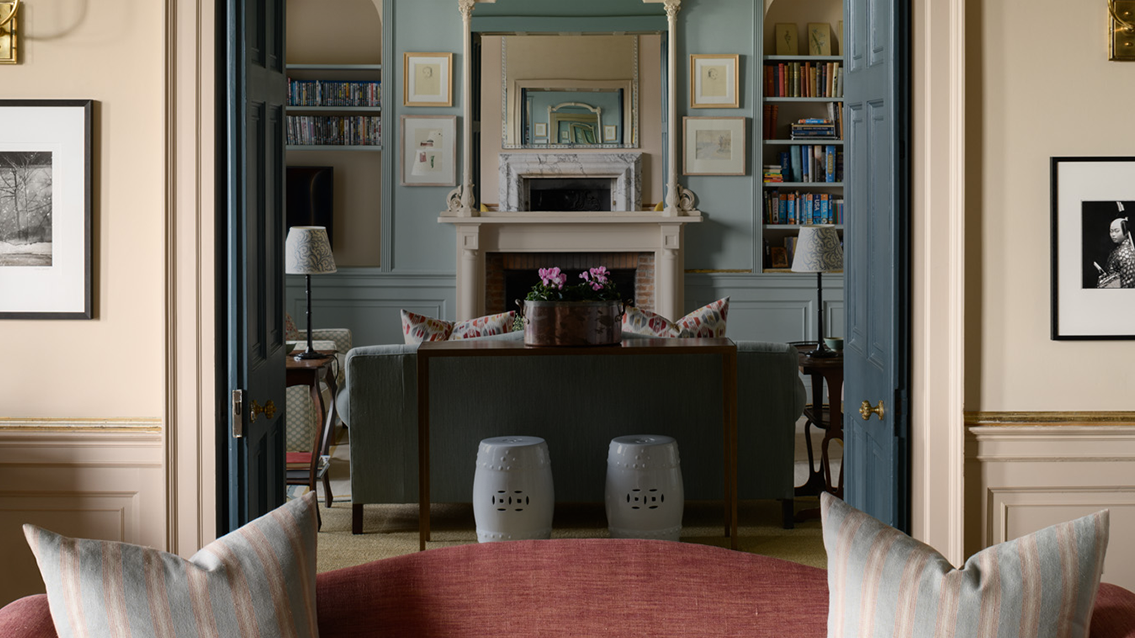
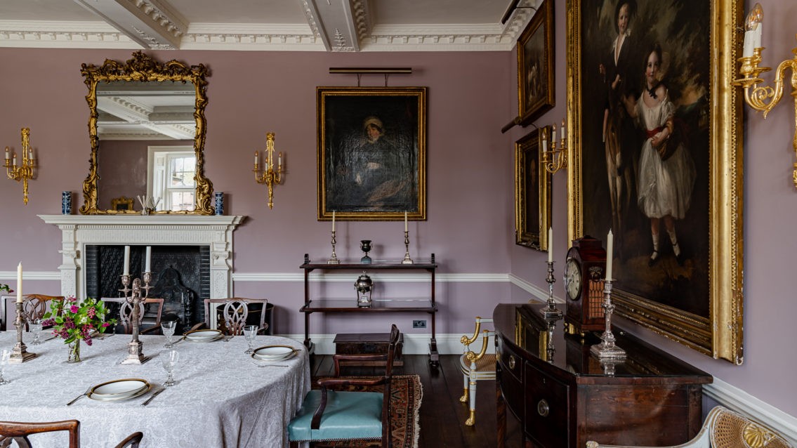
All our colours use a varied combination of pigments, so each one has a different undertone and can work in harmony in many schemes. For example ‘Wash Stop’, a subtle grey with a touch of lavender which works tonally with ‘Drab Green’ in the following room.
Picking the perfect off-white
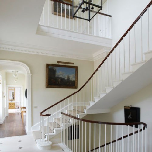
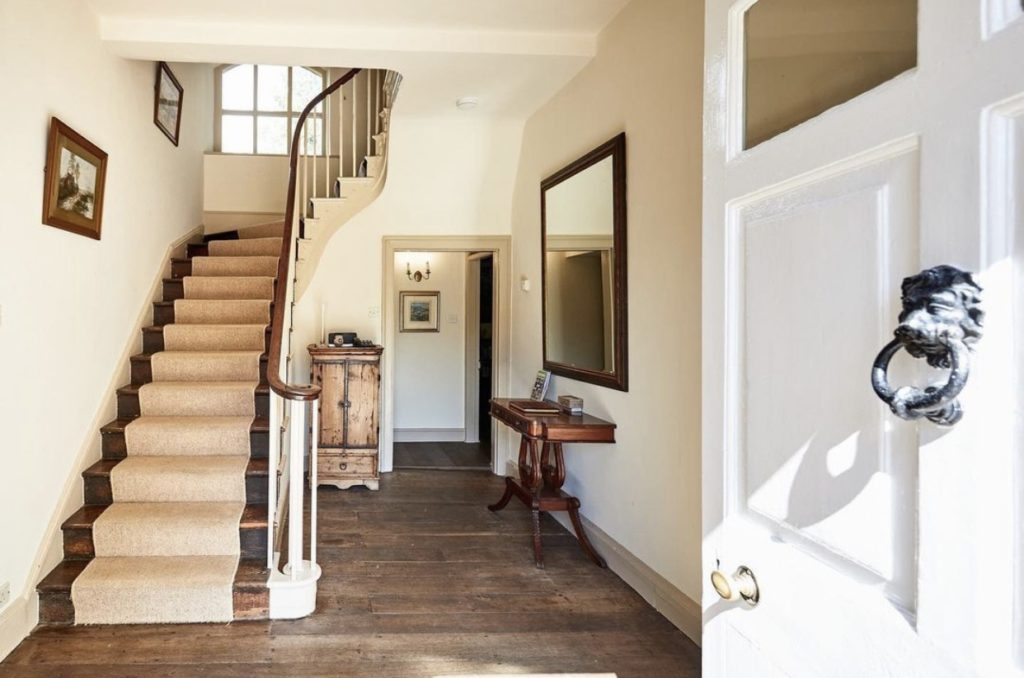
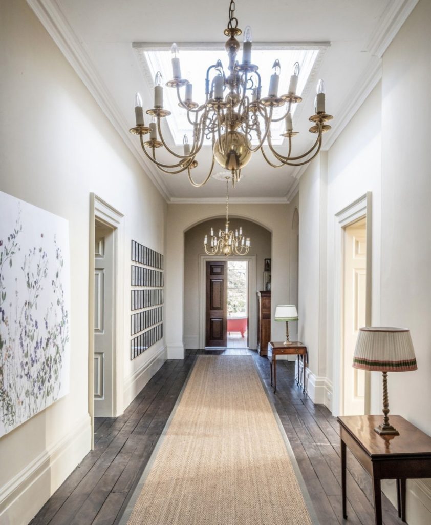
Often people contact us for help to find the perfect off-white. Choosing the right white is so important, especially when it’s for hall or hallway spaces. Some key things to think about is that white reflects light, delineates architecture and sets off other colours. White can be the perfect colour to use in a hall space and continued up a staircase so it’s key to chose the tonality of white to respond to other colours and finishes in your home.
When taking an architectural approach to design with controlled lines and functional materials it still requires one to make careful choices. In this home, 'Silver White' was used on the hallway and landings from the darker basement to the brighter top floor. It ties in the underlying silver tones in the timber floor and, whilst keeping the long hallway light, gives warmth and texture too.
Our whites are coloured with small amounts of earth pigment which result in warm, stoney and pinky whites. Warm tints will appear older and emphasise the warmth of other colours. Greyer whites will cool down other tones and appear more modern, as the yellowness. we associate with old whites is partly down to the use of oils which we no longer use.
Still not sure on what colour to go for? We are here to help! You can book a virtual or in home colour consultancy through our website HERE . Our colour consultants have all been trained by our founder and colour man Edward Bulmer and will come equipped with all the materials needed to help you find the perfect shade.
Make sure to order your free colour chart today.

