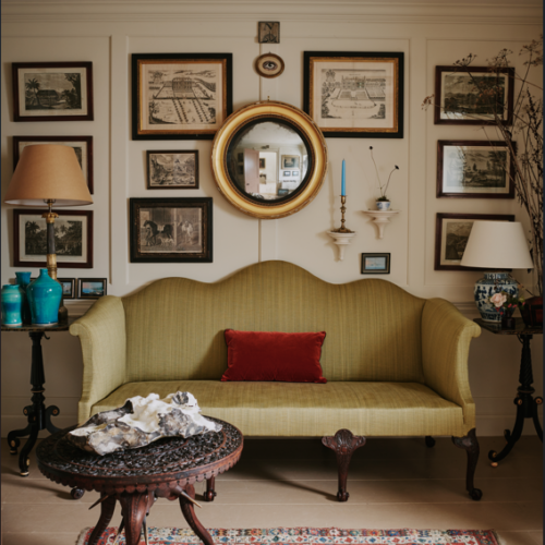
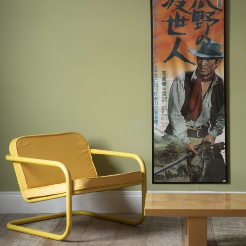
Spotlight on ‘Verdigris’
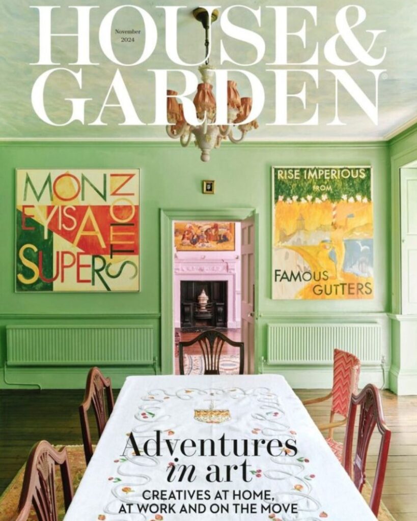
A beautiful Prussian blue based green with an underlying earthy tone, this green is opulent and radiant in abundance, offering a fresh but grounded. A green that you might not reach for immediately, but an un-sung hero that we are thrilled to see on the November 2024 cover of House & Garden at the home of Robert Montgomery and Greta Bellamacina. A country house in the heart of the Kent countryside, a residence of artistry, poetry and above all colour.
To honour this quite exquisite colour we have showcased some of our favourite rooms by top interior designers where this special green adorns the walls, and showing you what to pair it with. Green is a wonderful colour for those wanting to bring the outside in, but also uplifting, serene and can ground a space in a special way that other colours cannot.
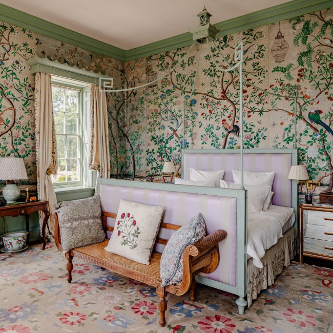
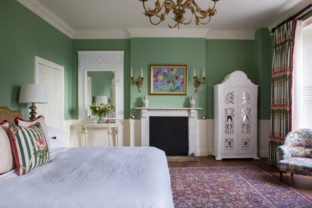
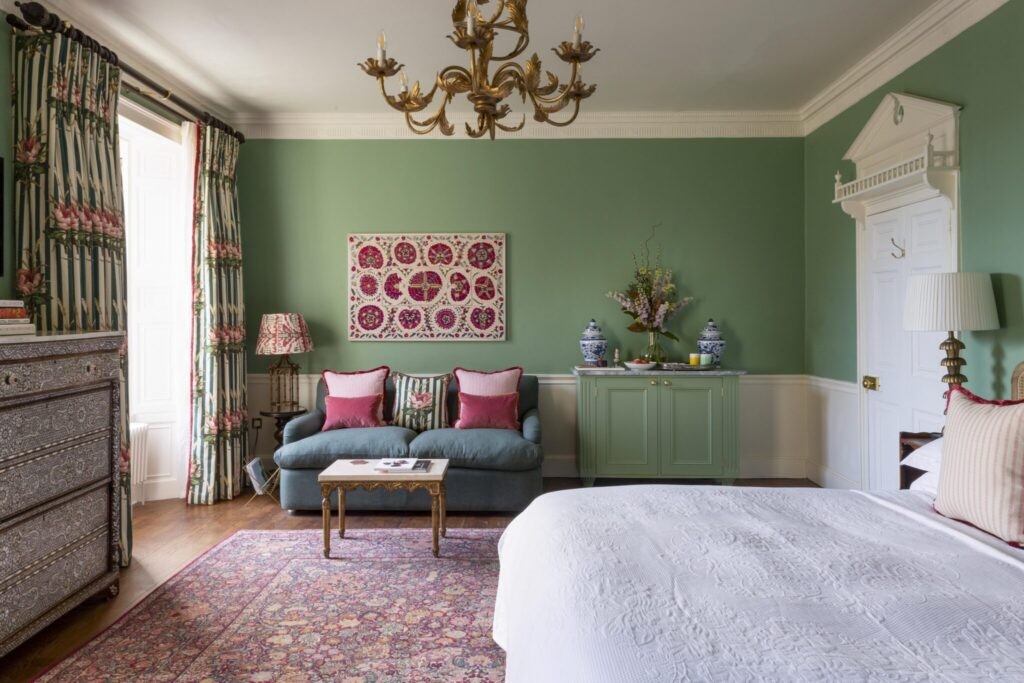
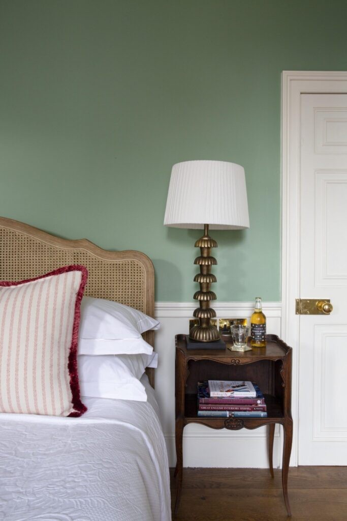
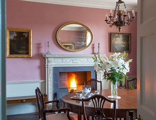
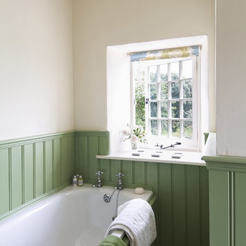
Tonal drenching in the bedroom
A timeless choice in this master bedroom; Verdigris with a trim of Sea Green, paired with antique Chinoiserie wallpaper dating back to around 1820, believed to be the original paper for Lambton Castle. Regency inspired decoration, such as the bed, designed by Edward as wedding gift to his wife Emma, take centre stage, with the soft greens creating a calm and tranquil space.
See more of Edward’s work as an interior designer in his wonderful book, The Colourful Past, Edward Bulmer and the English Country House, but your copy HERE


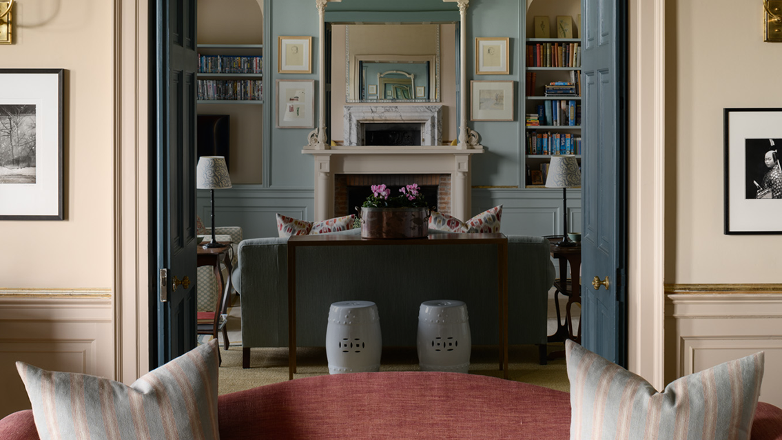
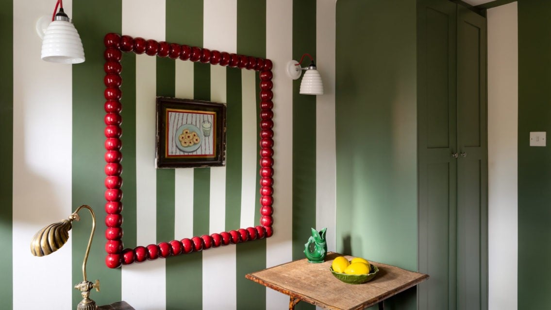
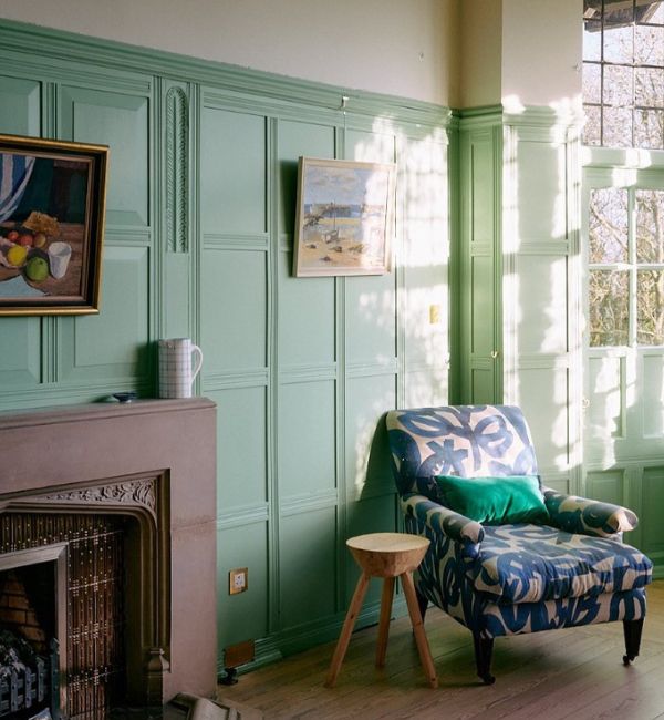
No1 Bruton in the heart of Somerset
This old building with its bowed beams and rustic charm oozes calm and chic, Claudia Waddams and Aled Reed are not afraid to use bold colours and pattern. From Fermoie fabrics to bold Morris & Co wallpapers, each room at this 12 bedroom boutique hotel tells a story. One of the bedrooms is head to toe in our beautiful green, event the staircase to the room is painted in ‘Verdigris’ paired with a beautiful paper, see how the light changes on the stairwell, our colours offer an unrivalled response to light which you need to experience.
‘We wanted a paint that was multi-faceted and felt unusual without being shouty; something mercurial and complex to suit the character of the building and the people who pass through the doors, ‘Verdigris’ is complicated in the best possibly way’
-Claudia Waddams and Aled Reed


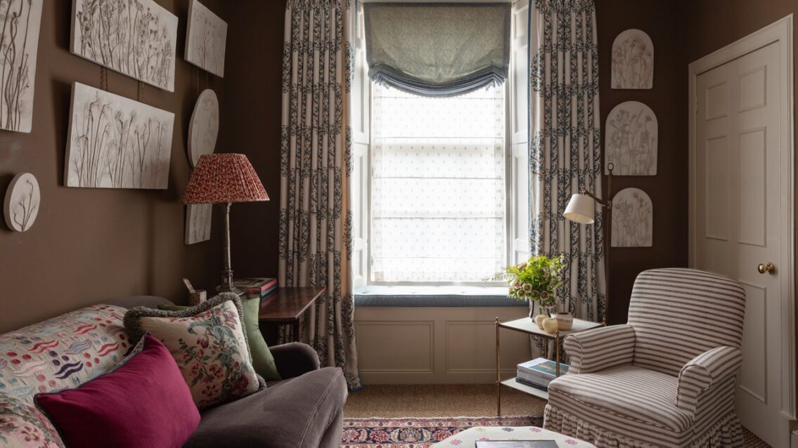
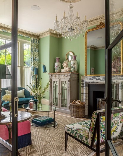
Verdigris used by Thompson Bell interior design
A Victorian house painted in Verdigris. Elegant and refined. Natural finishings, such as the sisal rug really make this room seem light and airy and we love the mix of old and new to bring this space to life.
“Originally I considered a more muted tone of green and I deliberated a little on this one, but in the end I was SO happy I went for this colour as it is such a delightful happy, vibrant and bright colour that is honestly such a joy to be in! We love sitting in this room, it is so striking and warming in the winter especially with the log burner on. I always get so many compliments on it when we are hosting. We paired it with Portland on the woodwork and ceiling rose which gives a softer contrast to using a brighter white. So pleased with it – this is such a versatile colour and works as a great base for all the colours we used – bright pink on the sofa, dark teal on the love seat etc..”
-Stephanie Thompson & Amy Bell, founders
Edward’s timeless colour wheel has inspired our whole range of colours and all of them have true historical resonance. Learn more about our paint and our commitment to sustainability and how using plant alternatives, mean they can return to the earth without polluting, watch our brand film here.
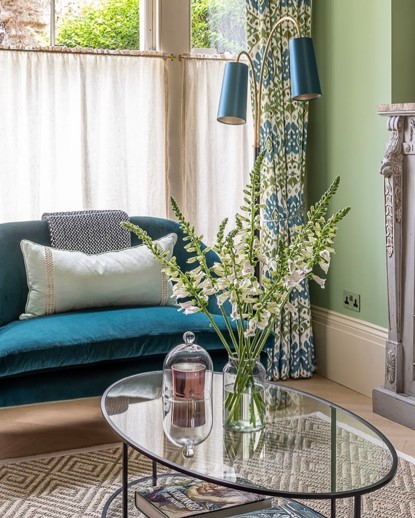


A life more colourful
This is the motto of Fi Douglas, founder of Bluebell Gray. Verdigris with the light pouring in. We love this reading corner and can imagine long lazy Sundays with a good book, surrounded by this special green.
“I really believe in the power of colour and print and how they can affect how we feel, that’s my driving force behind everything I do at Bluebell gray. Designing prints that bring joy to your home and make you feel good when you are surrounded by them.”
-Fi Douglas
If you want to know more about our colour range and the pigments used to create our earthy, tonal library, click here for a more in depth education into pigments and ingredients.


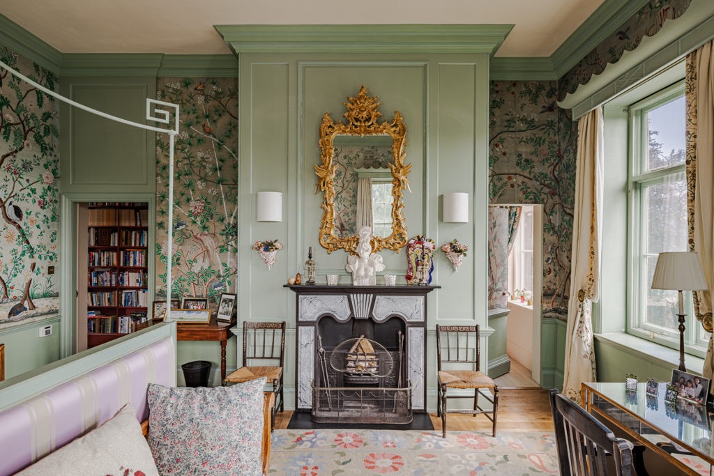
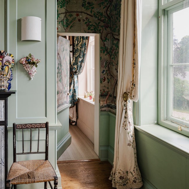
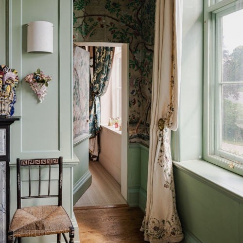
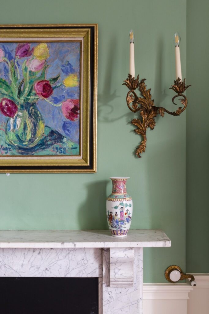
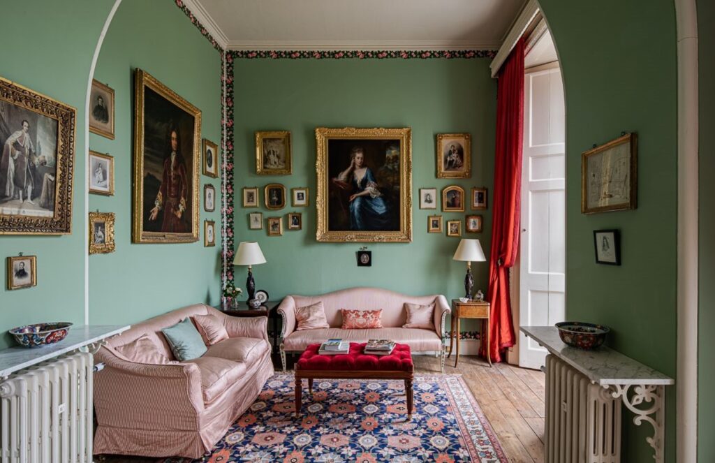
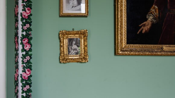
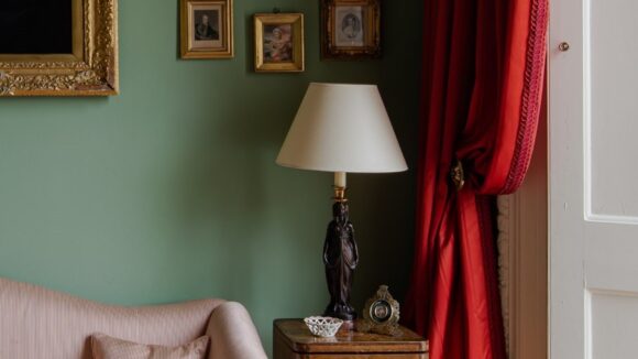
Verdigris at Chevening
This beautiful country house dates back over 800 years and it’s first residents served their country as soldiers and statesmen. It’s a grand building that Edward, our founder worked on as an interior designer and historic architect, to bring out the houses full potential, restoring and decorating it to former glory.
Previously decorated by the late and great John Fowler, this nook, just off of the dining room has a large window that looks out onto the lawn, ‘Verdigris’ is the perfect colour to mimic the view and add cheerful disposition to a smaller room. Cole and Son wall paper line the outer skirts of the walls, adding demure detailing to contrast with the colour- a great way to add some fun and character to a room and add a more sophisticated colour to the scheme.
“A good few of our colours count as what I call ‘happy’ colours – we don’t chase tones that are ‘achingly cool’ or ‘aristocratic mud’ we just want you to feel good when you are with them.
‘Verdigris is one of those as it is bright and natural feeling – a bit of the grass and a bit of the sky – everything that is lovely about a summer’s day. Being a transition shade it is amazingly good at combining with all sorts of other colours and tones. Its blueness embraces orange and brown tones and its greeny feel works with reds, pinks and purples.”
-Edward Bulmer
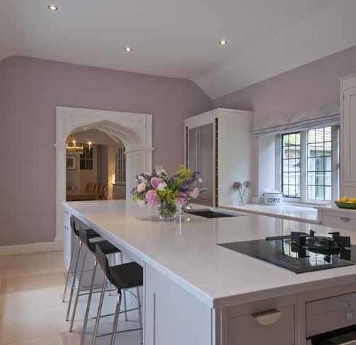
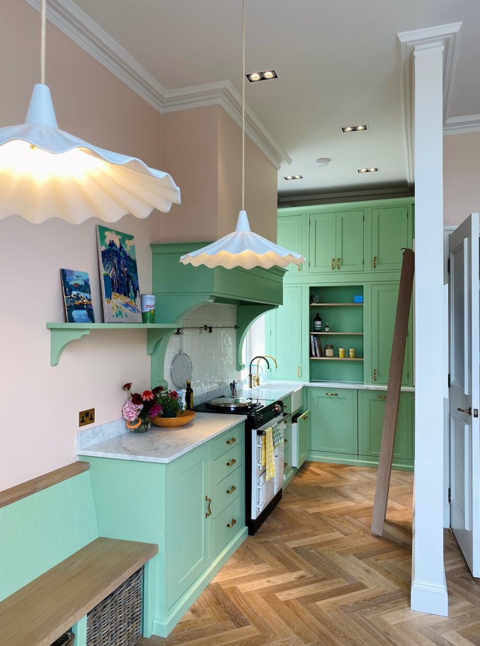
A gorgeous green kitchen at the home of Daisy Sims-Hilditch
Green on the woodwork in this adorable kitchen. A kitchen is often a room that you spend a lot of time in, so making it a cheerful space that relaxes you is key!


Explore our library of pigment rich greens HERE and find the perfect shade for you to help you bring the outside in.
Our natural paint offers a ‘living finish’ that you just can’t achieve using paints that are made from plastics. Kind to nature and based on gentle plant-based chemistry we believe that our natural paint is the safest, healthiest and most beautiful paint on the market. Order your FREE colour chart today.
Need help, why not explore our colour consultancy options here. We offer in home, in store and virtual colour consultancy’s to fit in with your busy schedule and with every colour consultancy enjoy 10% off all paint orders forever more!