The arrival of sunnier days, lighter evenings and bank holidays inspire us to refresh our homes and spring clean. There is no better time to give a room a fresh coat of paint and the south-facing room is a great place to start. At this time of year they are filled with natural light during the day, benefitting from the lovely spring sunshine. This consistent brightness offers more flexibility in colour choice than north-facing spaces, but we recommend selecting shades that complement the natural light for the most harmonious effect. If you’re not sure where to start, our colour consultants have chosen the perfect paint colours for your south facing room.
WHITES AND NEUTRALS
If you want to create a modern look or a calming atmosphere, our warm whites and neutrals shine in the south-facing light. Spanish White is a bright white with a slight yellow ochre tone of natural chalk. It responds to light in a way synthetic paints cannot recreate. Pearl Colour is an elusive white containing hints of earth pigments. The sunlight falling on these whites will make them appear even warmer.
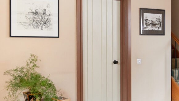
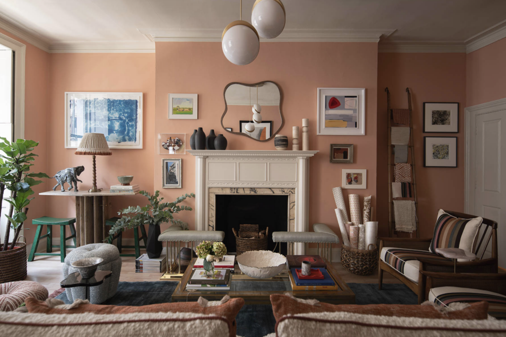
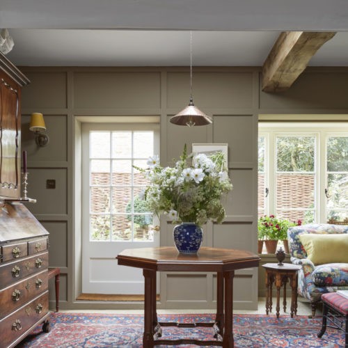
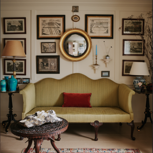
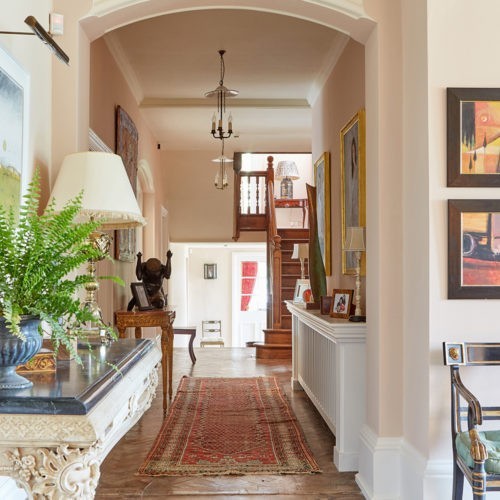
Clove, Cinnamon and Lilac Pink are popular warm neutrals that will enhance the feeling of light. These soft pale tones are all warm and welcoming. Clove is a deep beige with earthy red oxide that really wraps the colour round a space. Cinnamon has the lovely, soft feel of the summer drenched stucco of Tuscan facades and Lilac Pink is not quite lilac and not quite pink, depending on the light, making it incredibly versatile as a result. It warms up a hall beautifully, is at home in a bedroom, but also works as a main room neutral.
All three colours are available in lighter shades of the original, with 60%, 40% and 20% lighter for versatility.


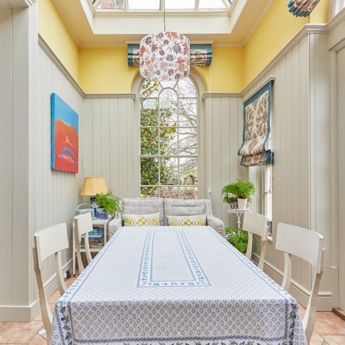
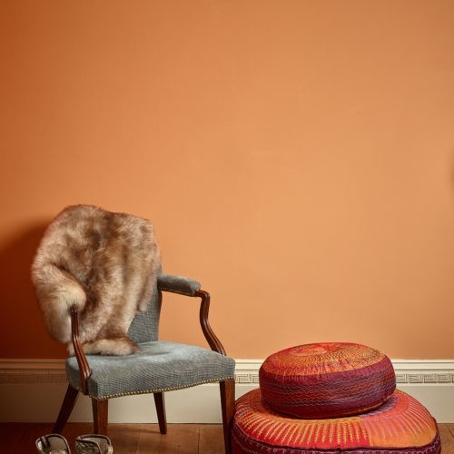
YELLOWS, BROWNS AND EARTHY TONES
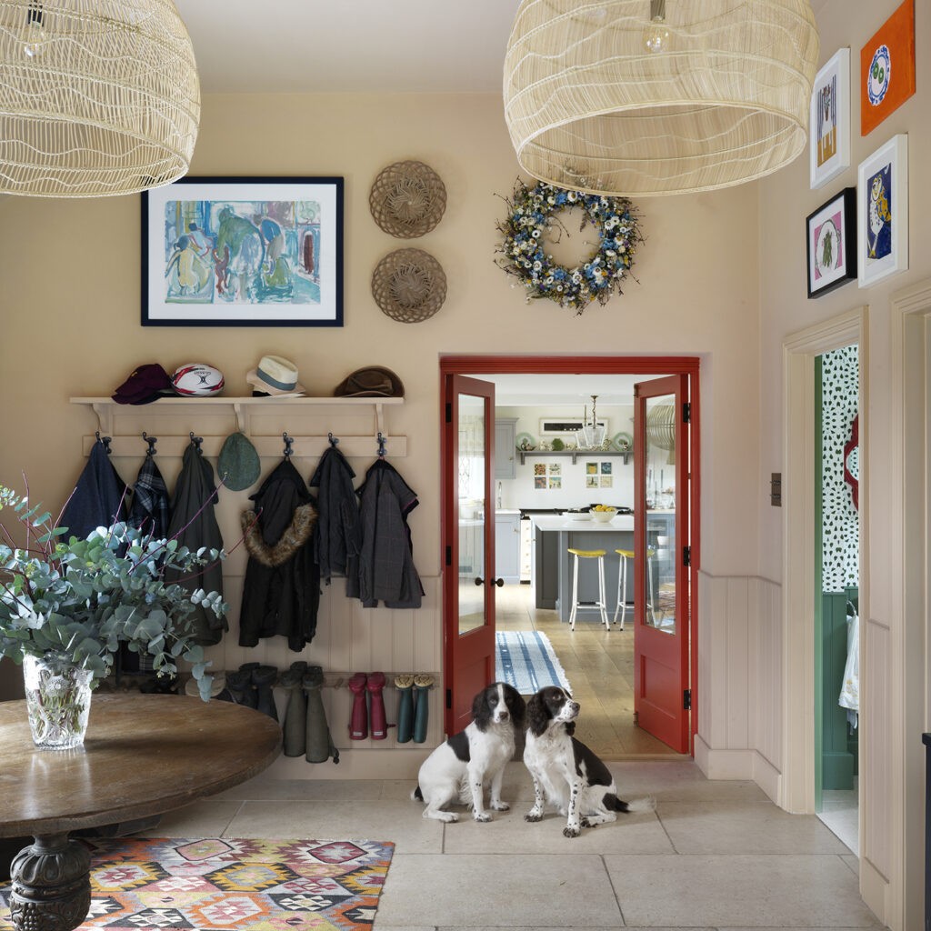
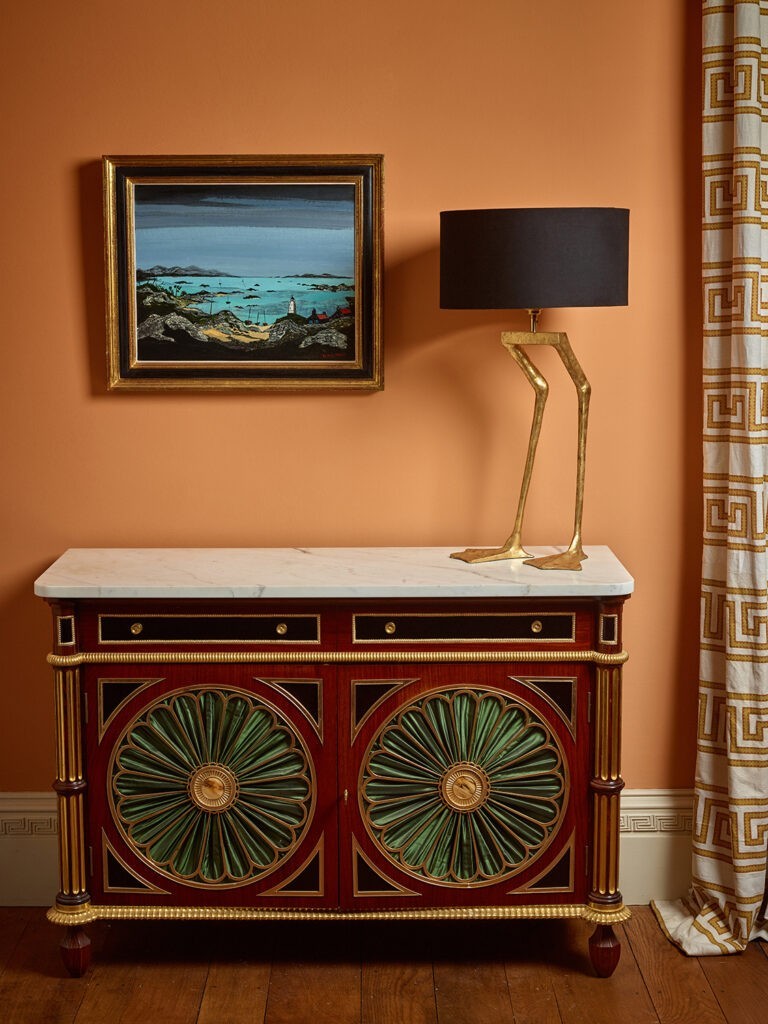
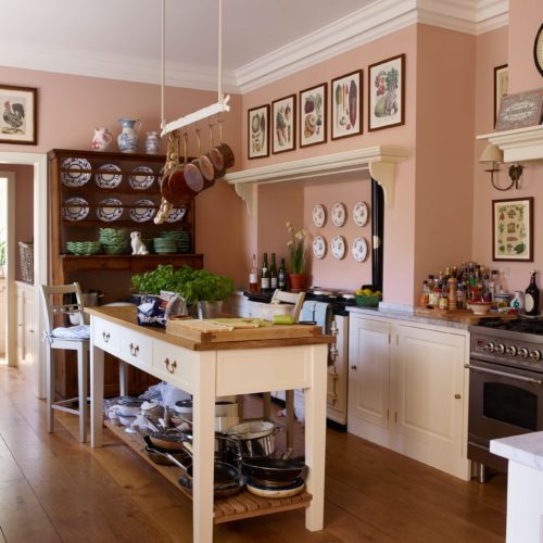
Choosing earthier tones such as Brimstone, Dutch Orange, Mummy or Header are excellent ways to embrace and enhance the warm, natural light that pours in throughout the day. These tones work beautifully in sun-drenched spaces and create a cosy, welcoming feel with a vibrant, earthy touch. Header was the winner of House & Garden Colour of the year 2024.


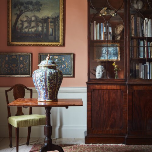

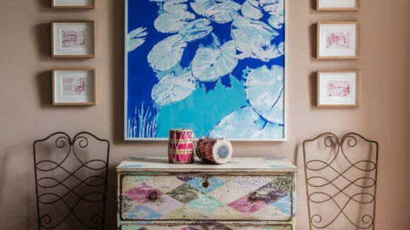
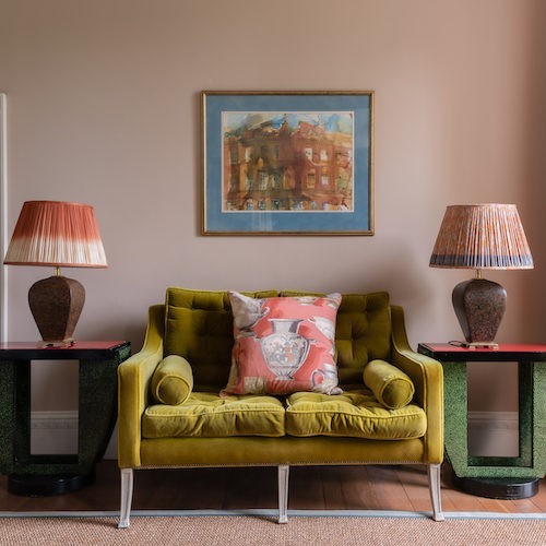
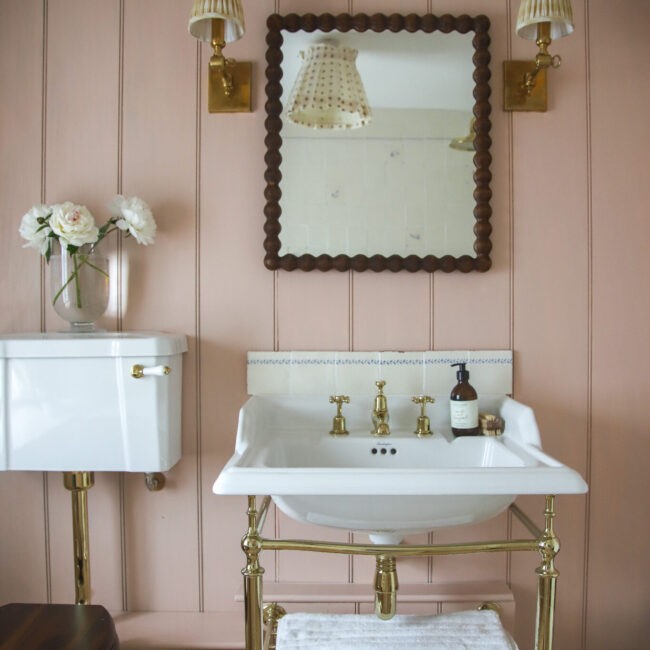
PINKS AND BLUES
Subtle, mature pinks will feel delicate and sophisticated in the warmer light and will create a restful atmosphere. Our bestselling pinks, Cuisse de Nymphe Emue and Jonquil illustrate this perfectly. Jonquil is also part of our Forever Favourites collection.
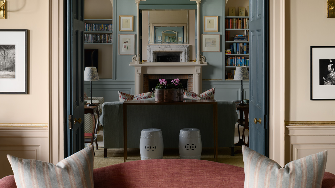
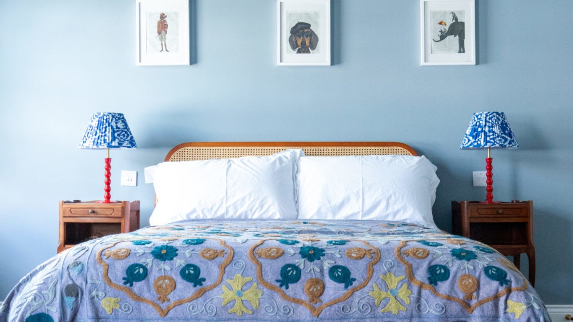
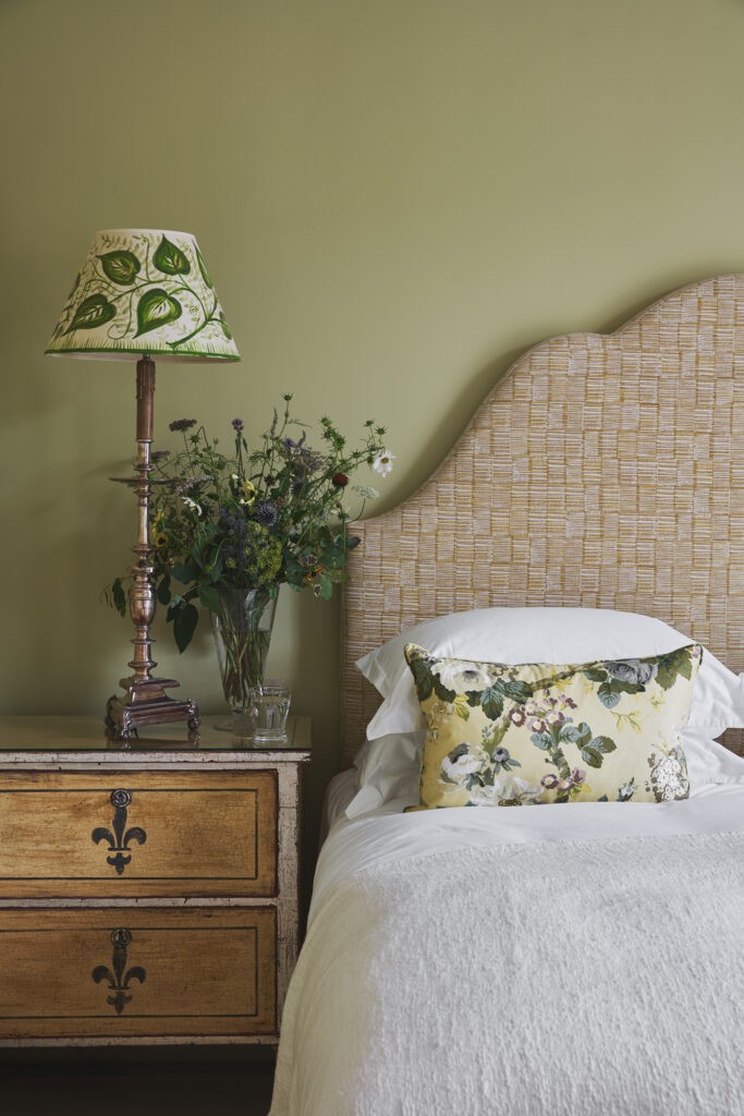
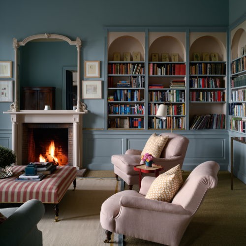
Soft blues, such as Ethereal Blue is a good choice for a South facing room as the airy colour balances out the warmth of southern light. This will keep the room feeling fresh and looks particularly lovely in this bedroom by Carlos Garcia Interiors.

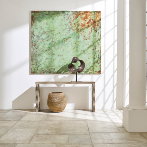
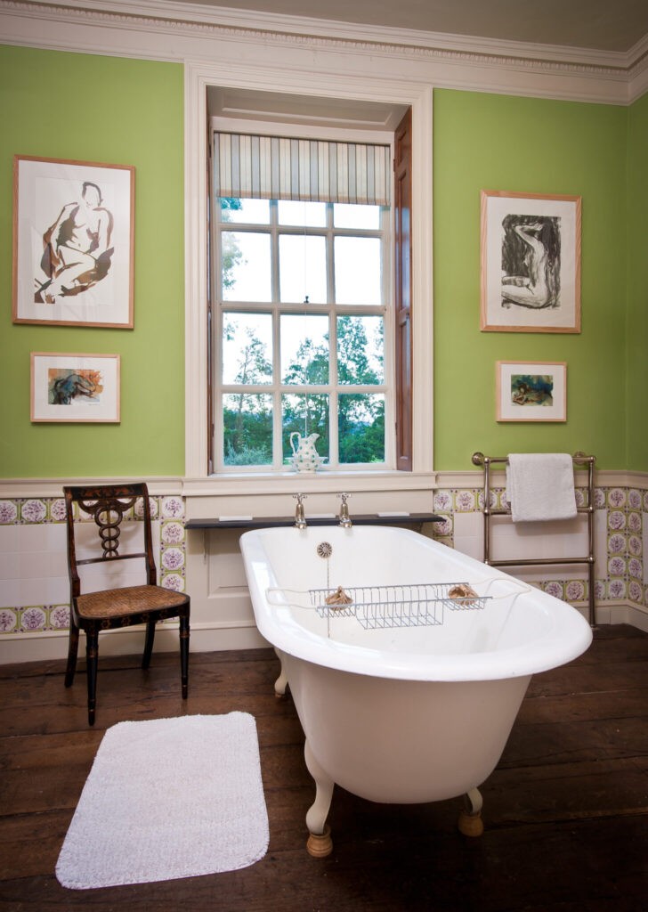
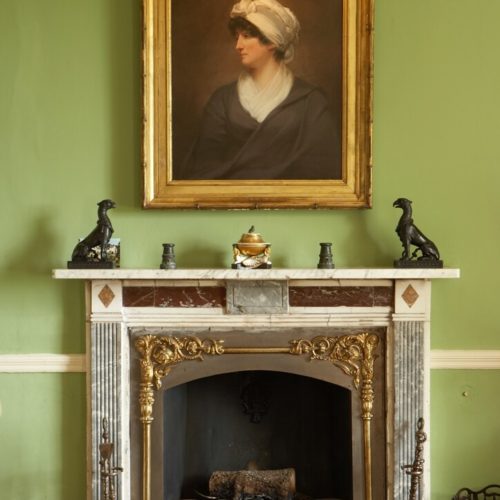
GREENS
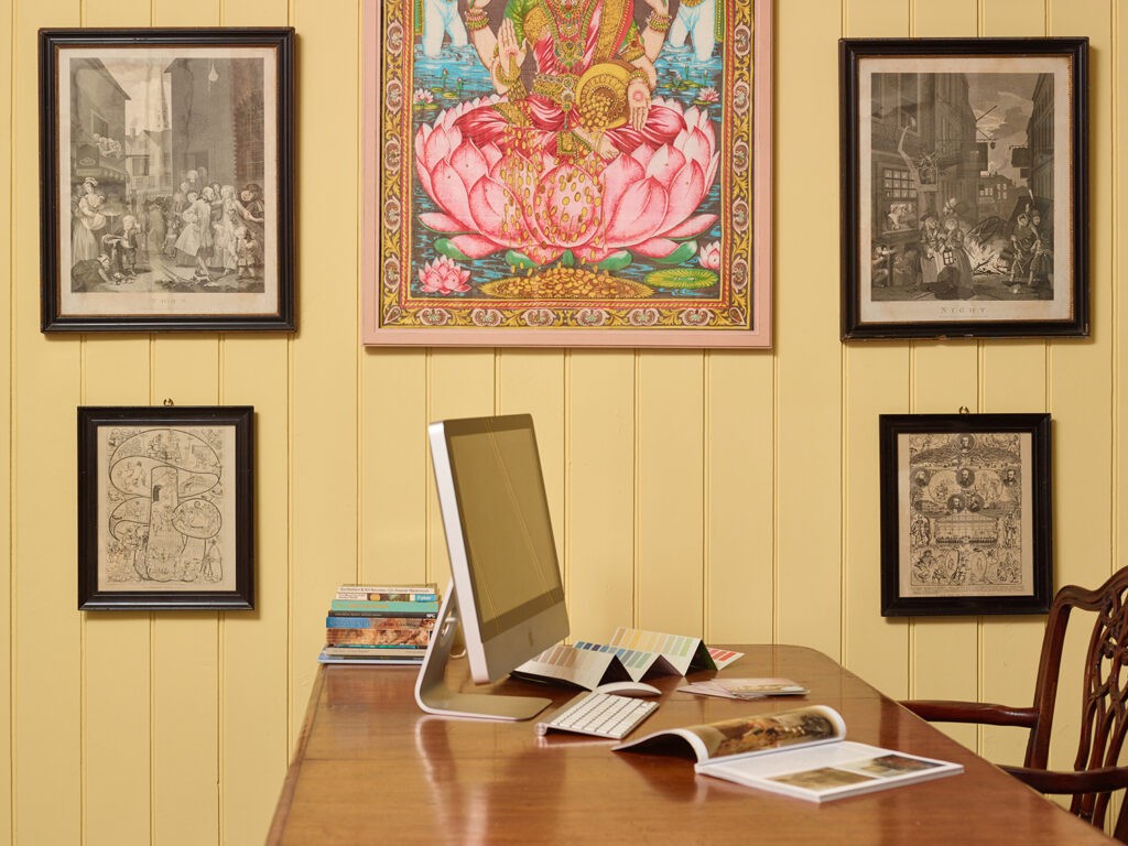
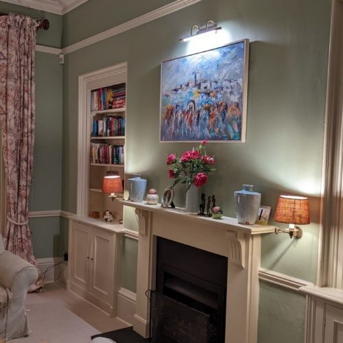
Greens can work beautifully in a south facing room, especially if you’re aiming to cool down the warm, golden light or create a refreshing atmosphere. The generous natural sunlight in these spaces means you can get creative with cooler colours without the risk of them feeling too chilly or dull. Tea Green and Pea Green are two colours chosen by our consultants for south facing rooms. Tea Green works well in period properties, particularly Georgian, Edwardian and Victorian homes, whilst Pea Green is a fresher green and a great background for artwork, from pictures to textiles.


No matter the colour, always test samples at different times of day in your space. The unique light in a south-facing room will subtly change, depending on the time and weather, so testing in different areas will help you choose the perfect tone to complement your home.
If this has inspired you to consider other rooms in your house, read about our colour consultants choices for the North Facing Room.
Our consultants are available at the end of the telephone or can visit you in person to give you colour advice tailored to you and your home, wherever you live in the country!